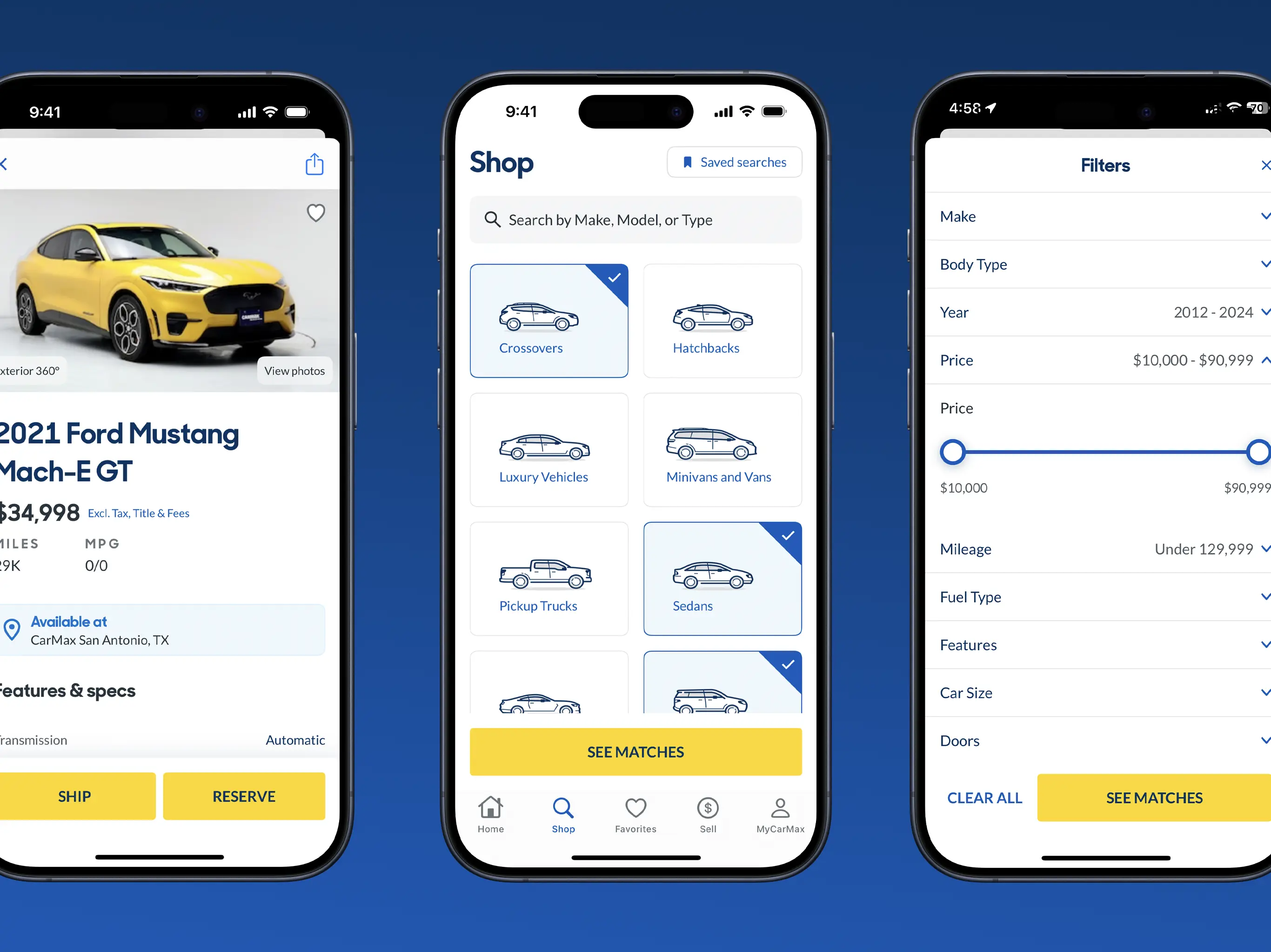
The CarMax app helps customers find the perfect car, reserve a test drive, get a vehicle shipped to their store, keep up with important vehicle and service documents, and more.
I worked on the Native Apps team at CarMax to build out their flagship app. Our team worked to rewrite the app in (almost entirely) Swift and SwiftUI. We focused on taking advantage of Swift concurrency and Combine to deliver a high-quality and incredibly reliant app to CarMax’s customers. While I cannot share specific details here, I will point out a few features that I am proud to say I worked on and shipped!
360º Car Viewer
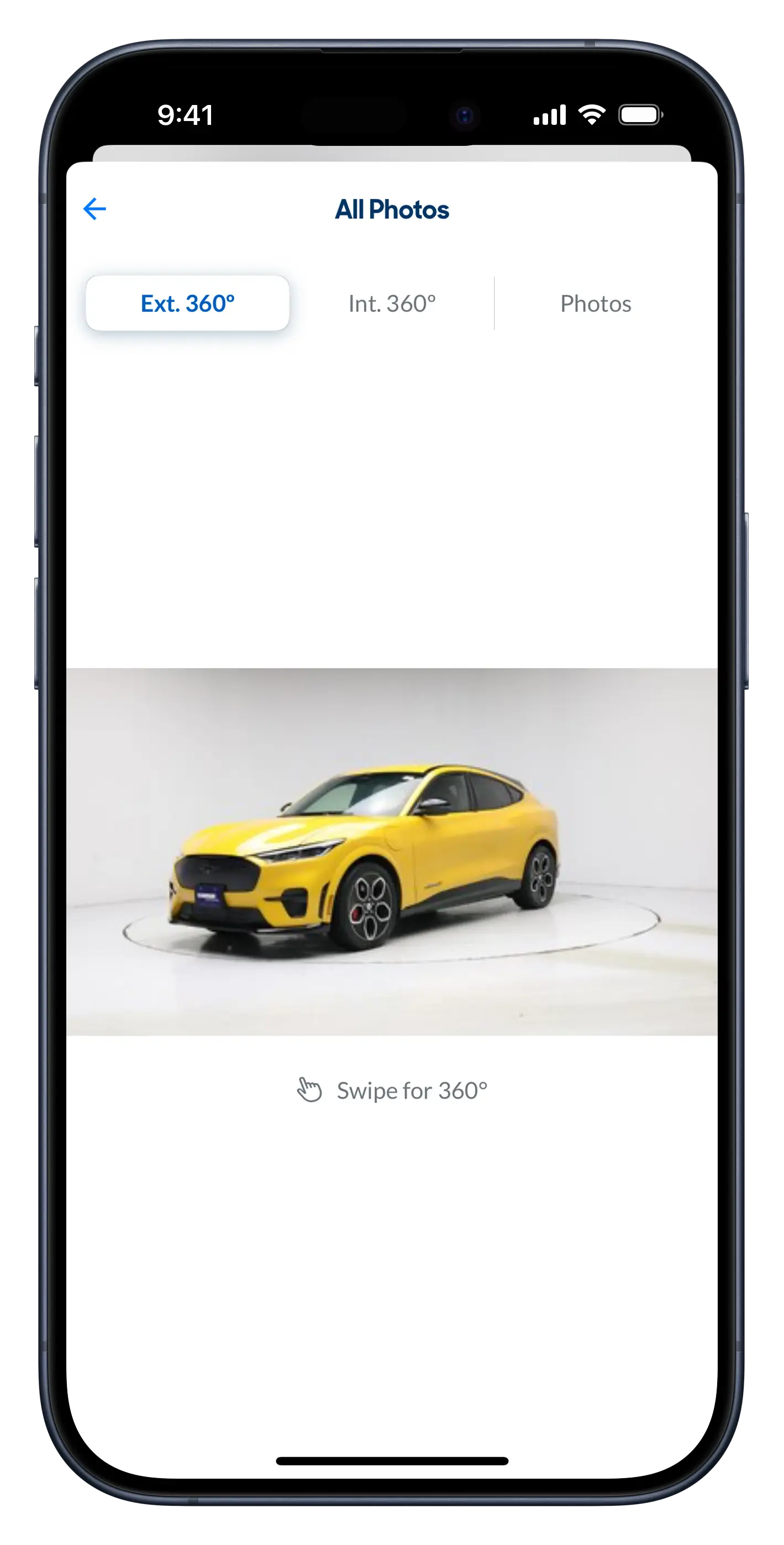
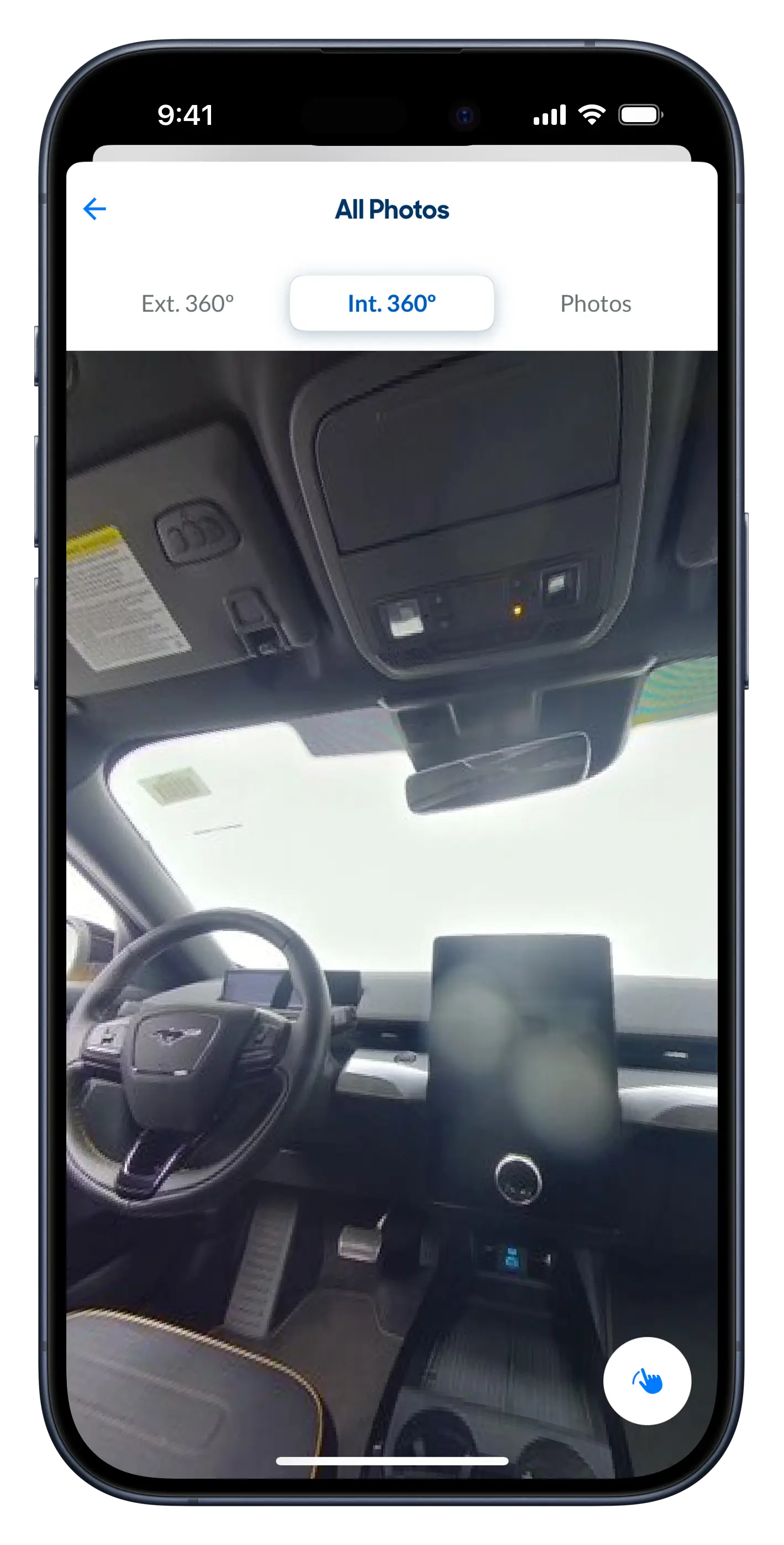
The CarMax app lets customers explore every vehicle with immersive views both externally and on the inside of the car. On the outside, CarMax shows a 360º panorama of the car so customers can see a vehicle from every angle. And, on the inside, customer’s can virtually look around to see the dashboard, seats, and get a great view of the car — before they even set foot at a CarMax store. I worked on building these features, then on optimizing them to make them work well over high-latency network connections and on a range of device models.
Search Filters
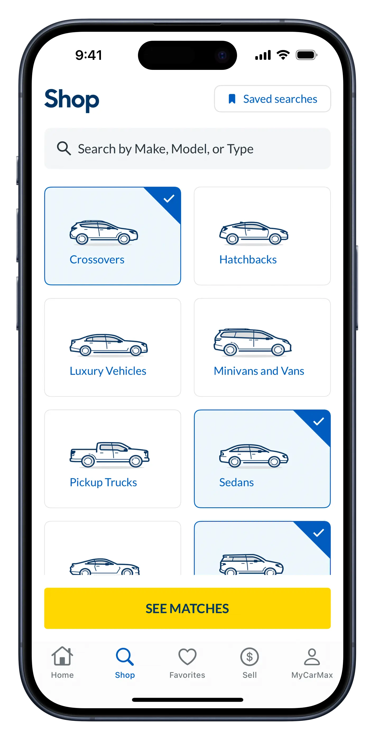
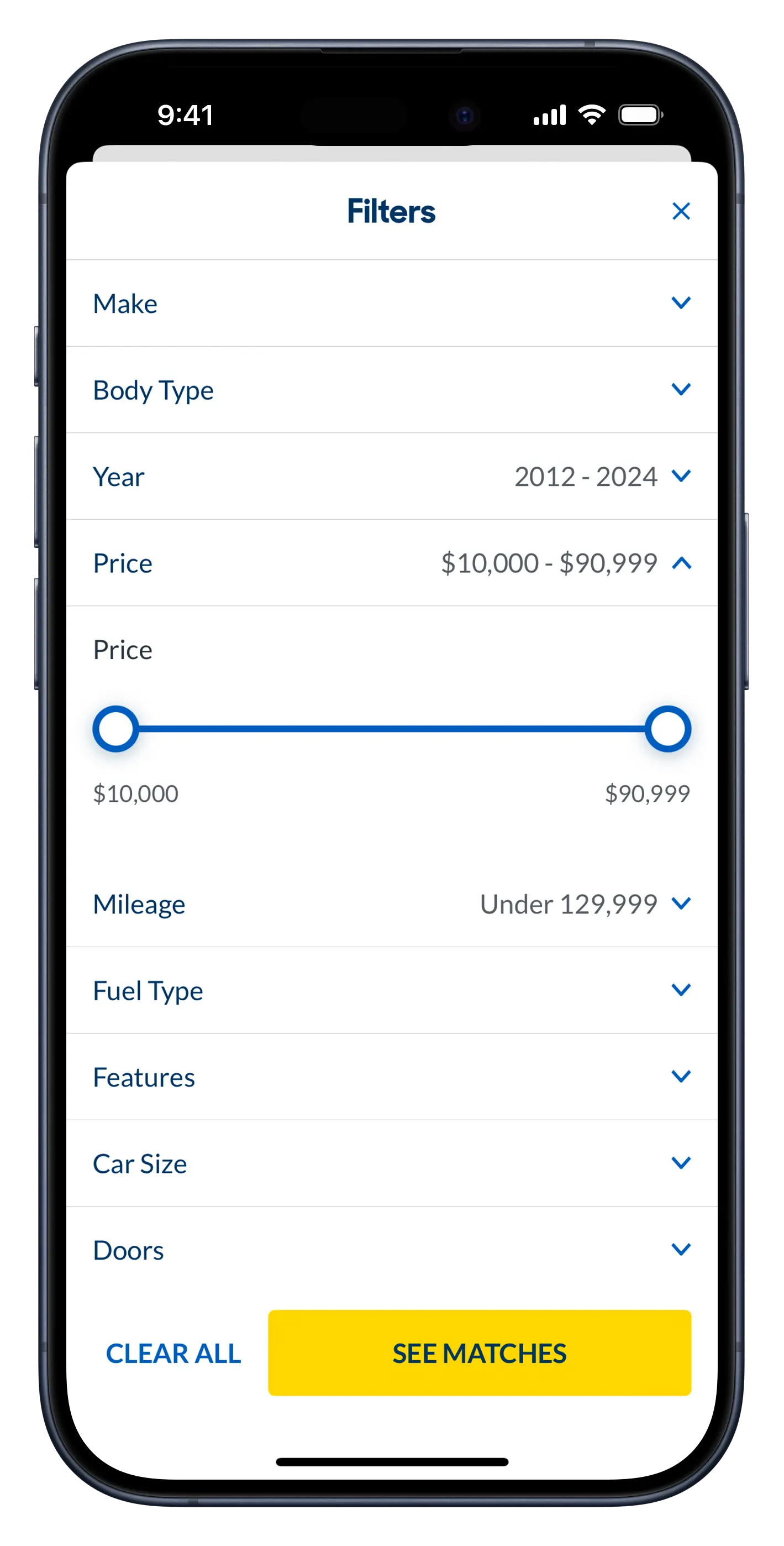
CarMax customers use the app to find their next car, so the search screen is a crucial area. Customers start by either typing a search term or choosing from one or more vehicle types (e.g. sedan, SUV, etc.). Once the search has begun, a customer can narrow down their results even further by turning on filters. For example, in the screenshot below, you’ll see a price filter with an entirely custom range slider. I helped the team implement the interfaces for these screens and make them accessible (e.g. adding VoiceOver support, rotor controls, and other visual aids).
A Few Comments
While I can’t share much detail about this project, I can say I am incredibly proud of the work I did on the CarMax Native Apps team. I got the opportunity to spearhead initiatives with SwiftUI, accessibility, and some fantastic features. But more importantly, I worked with an incredible group of engineers, designers, project managers, and architects. We were able to completely rewrite the flagship CarMax app using clean architectural paradigms, some of the latest industry best-practice technologies, and beautiful new designs.
